Wednesday 25 March 2015

Pop art/ 50s' design

POP ART is name given to art made in America and Britain from the mid 1950s and 1960s that drew inspiration from sources in popular and commercial culture includes artists Roy Lichtenstein, Andy Warhol and David Hockney.
Pop art employs aspects of mass culture, such as adverting, comic books and mundane cultural objects
it is similar to DADA
Pop art began in the mid 1950s and reached its peak in the 1960s. It was a revolt against prevailing orthodoxies in art and life and can be seen as one of the first manifestations of postmodernism. Sources pop artists used for their work included Hollywood movies, advertising, packaging, pop music and comic books.By creating paintings or sculptures of mass culture objects and media stars, the Pop art movement aimed to blur the boundaries between "high" art and "low" culture. The concept that there is no hierarchy of culture and that art may borrow from any source has been one of the most influential characteristics of Pop art.
Since the early 1960s, when the American version of Pop Art seemed to extinguish the spiritual and existential ambitions of Abstract Expressionism, an assumption was quickly made that this new art was the triumph of a fully ascendant materialist America
"Pop is everything art hasn't been for the last two decades. It's basically a U-turn back to a representational visual communication, moving at a break-away speed...Pop is a re-enlistment in the world...It is the American Dream, optimistic, generous and naïve.
The subject matter became far from traditional "high art" themes of morality, mythology, and classic history; rather, Pop artists celebrated commonplace objects and people of everyday life, in this way seeking to elevate popular culture to the level of fine art. Perhaps owing to the incorporation of commercial images, Pop art has become one of the most recognizable styles of modern art.


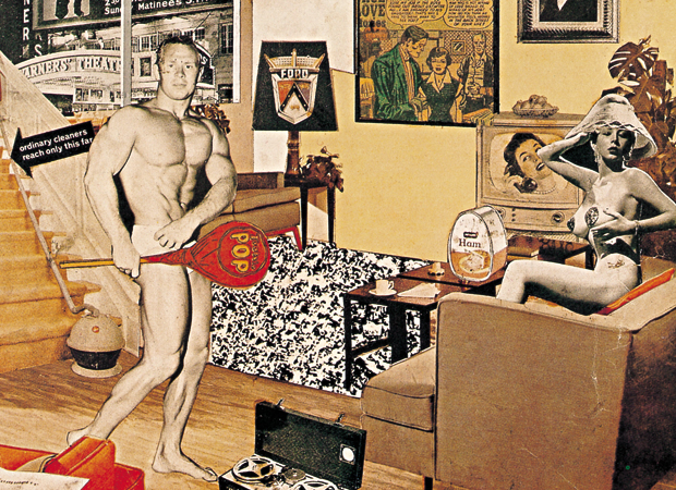
Richard Hamilton ''JUST WHAT IS IT THAT MAKES TODAY'S HOMES SO DIFFERENT, SO APPEALING? (1956. Hamilton's 1956 collage was a seminal piece for the evolution of Pop art and is often cited as the very first work of Pop art. Created for the exhibition This is Tomorrow at London's Whitechapel Gallery in 1956, Hamilton's image was used both in the catalogue for the exhibition and on posters advertising it. The collage presents viewers with an updated Adam and Eve (a body-builder and a burlesque dancer) surrounded by all the conveniences modern life provided, including a vacuum cleaner, canned ham, and television. Constructed using a variety of cutouts from magazine advertisements, Hamilton created a domestic interior scene that both lauded consumerism and critiqued the decadence that was emblematic of the American post-war economic boom years.
The word 'POP' was first coined in 1954, by the British art critic Lawrence Alloway, to describe a new type of art that was inspired by the imagery of popular culture. Alloway, alongside the artists Richard Hamilton and Eduardo Paolozzi, was among the founding members of the Independent Group, a collective of artists, architects, and writers who explored radical approaches to contemporary visual culture during their meetings at ICA in London between 1952 and 1955. They became the forerunners to British Pop art. At their first meeting Paolozzi gave a visual lecture entitled 'Bunk' (short for 'bunkum' meaning nonsense) which took an ironic look at the all-American lifestyle. This was illustrated by a series collages created from American magazines that he received from GI's still resident in Paris in the late 1940s. 'I was a Rich Man's Plaything', one of the 'Bunk' series, was the first visual artwork to include the word 'POP'. 

50s' Design 

In the 1950s many countries were recovering from WWII. Across Britain, towns and cities were being rebuilt and redeveloped, more women were working in office and industries than ever before, and a sense of post-war optimism was beginning to flourish.
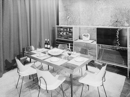
The 1950s were the age of the consumer. The post-war boom brought massive changes in the home; it was out with the old and in with the new. Open-plan living was introduced, and the fitted kitchen with its brand new appliances was the housewife's domain.


History of Printing press and printing/ Developing of the newspapers and magazines design

Alexey Brodovitch was a was a Russian-born  photographer, designer and teacher. However, he was most famous for his art direction, primarily for the magazine Harper's Bazaar from 1934 to 1958. He spent his early life in and out of the military before spending time in Paris, which is where he began his career in the graphic arts. His first major success came after winning a poster competition for a local theater, the 2nd place poster was created by Picasso. He was famous for revolutionizing the way the magazines are designed. He was recognized for the way he used the colours, how the images are cropped, the dynamic and the composition of the layout. His designs were well balanced on the page layout and the elegancy of the typography he uses. 

The Bal Banal poster on the streets of Paris
Brodovitch remained proud of this poster throughout his career, always keeping a copy of it pinned to his studio wall. The graphic, light-to-dark inversion of its mask shape, type, and background suggest not only the process of photography, but also represents the process of trading one's identity for another when wearing a mask.
 It is the oldest surviving work by Brodovitch. 

Brodovitch created a harmonious and meaningful whole using avant-garde photography, typography and illustration. After being hired he asked several old friends like Man Ray, Jean Cocteau, Raoul Dufy, Marc Chagall and A.M. Cassandre to work for the magazine. Cassandre created several of the Bazaar covers between 1937 and 1940. Brodovitch was the first art director to integrate image and text. Most american magazines at that time used text and illustration seperately, dividing them by wide white margins.


Harper's Bazaar, 
April 1940 
Design by A.M. Cassandre

This spread from 1935 shows the integration of all graphic elements. Brodovitch accentuates the fluidity and movement of the images by using repetition and diagonal and horizontal stress. He uses the contacts like frames from a film and creates the illusion of movement and spontaneity across the left-hand page. The strips of film overflow onto the opposing page, as if the dancers have twirled across the spine of the magazine. The enlargement on the right-hand page depicts the grand finale of this dance numer.

Ramon and Renita 
Article in Harper's Bazaar, Photographs by Martin Munkacsi. 
1935

Brodovitch cropped his photograhps, often off-center, brought them to the edge of the page, integrated them in the whole. He used his images as a frozen moment in time and often worked with succeeding pages to create a nice flow trough the entire magazine. This brought a new dynamism in fashion layouts.

Mock-up spread for 
Harper's Bazaar 
c. 1940-1950

The typeface he preferred was Bodoni, but when needed he switched to Stencil, Typewriter or a script. He matched the typeface with the feeling or with the need for an appropiate effect. Legibility was not his primary concern. 

His layouts are easily recognized by his generous use of white space. Colleagues at other magazines saw his sparse designs as truly elegant, but a waste of valuable space.


The Consensus of Opinion Article in Harper's Bazaar, Photograph by Man Ray 
March 1936

New Arrangements for Dinner. 
Article in Harper's Bazaar, Photographs by 
Gleb Derujinski. 
November 1951

If you don't like full skirts... 
Article in Harper's Bazaar, Photographs by 
George Hoyningen-Huene 
March 1938


"He taught me to be intolerant of mediocrity. He taught me to worship the unknown." - Art Kane, fashion and music photographer

"I learned from him that if, when you look in your camera, you see an image you have ever seen before, don't click the shutter." -Hiro, fashion photographer
"The Alexey Brodovitch course... really changed the direction of my life. It was not anything that Brodovitch taught specifically, it was an ambiance that he created, a connection that he would make with particular students. He'd try to get them to move in directions that they were already discovering." - Davit Attie  fine art and commercial photographer  

"He once said "we learn by making mistakes. We must be critical of ourselves and have the courage to start all over again after each failure. Only then do we really absorb, really start to know."

David Carson (born September 8, 1954) is an American graphic designer, art director and surfer. He is best known for his innovative magazine design, and use of experimental typography. He was the art director for the magazine Ray Gun in which he employed much of the typographic and layout style for which he is known. In particular, his widely imitated aesthetic defined the so-called "grunge typography" era.

"I have a degree in sociology, and taught that for a few years, then somewhat by chance, I took a two-week summer workshop at the university of arizona – about this thing called ‘graphic design’. it changed everything. I hadn’t even known the term graphic design before then.
"I describe my design as experimental, intuitive and personal. I have no formal truanting, which helped a lot as i never learner all the things I'm not supposed to do. I just did what made sense to me... I knew nothing about grids, formulas, school of thought etc., I just did what felt right."


Sunday 30 November 2014

Design in post-war Britain/The 1950s part 1/ The Festival of Britain

The Council of Industrial Designstarted on December 19, 1944 as the Council of Industrial Design was founded by Hugh Dalton, in the wartime Government. And its objective was 'to promote by all practicable means the improvement of design in the products of British industry'.

S. C. Leslie, the Council's first director, played an important part in the ''Britain can make it'' exhibition of 1946. It was 1947 successor Sir Gordon Russell who established the organisation's model for the next 40 years. Under Sir Paul Reilly in the early '70s, the organisation changed its name to the Design Council in 1972'' . 'Britain Can Make It' exhibition, organised by the Council of Industrial Design was a showcase for British design and manufacturing, and was a precursor to the more widely celebrated Festival of Britain in 1951.The aim was to display the latest consumer goods and promote the best of British design and industrial production. The exhibition occupied some 90,000 square feet of the Victoria and Albert Museum in London, and attracted 1,432,546 visitors. It contained over 5000 items produced by British manufacturers and encompassed most types of consumer goods including furniture, tableware, domestic appliances, household equipment, carpets, wallpapers, clothing and toys. Britain Can Make It did not adopt the traditional format of a trade exhibition, in which companies bought space to display whatever they wished. Instead, the CoID itself selected all the items that were displayed, and in doing so it used the exhibition to promote its own particular notion of 'good design' the CoID rejected redundant ornament and the superficial 'styling' of objects in favour of plain, ostensibly functional forms that embodied an efficient use of appropriate materials.


Britain Can Make It', colour lithograph poster advertising the exhibition organised by the Council of Industrial  Design, held at the Victoria and Albert Museum, 24 September – 31 October 1946, designed by Ashley Havinden, Great Britain, 1946, CIRC.459-1971. Victoria and Albert Museum, London.
Living room setting at the 'Britain Can Make It' exhibition, 1946

Furnished living room at the 'Britain Can Make It' exhibition, 1946
Prototype electric bicycle displayed at the 'Britain Can Make It' exhibition, 1946
Three kettles included in the 'Britain Can Make It' exhibition, 1946

The Festival of Britain


The Festival of Britain emblem, designed by Abram Games, from the cover of the South Bank Exhibition Guide, 1951. 
The logo uses the traditional red, white and blue colours of the Union Flag. The main device incorporates a profile of Britannia's head, with crested helmet, on the "north" point of a four-pointed compass rose Games added a row of bunting flags to his first design concept when asked to make it more festive. The anticlockwise halves of each compass point are coloured, with the clockwise halves white: the "east" and "west" points are red and white, and the "north" and "south" points (including Britannia's head) are blue and white. The figures "19" in blue and "51" in red appear in the lower left (SW) and right (SE) quadrants, with quarter circles of bunting below connecting the "south" compass point to the "east" and "west" points, with six flags either side of the "south" point and a pattern of four flags (white, red, white, blue) repeated three times. A version used on official publications places the logo on a background quartered in a background colour and black, surrounded by four additional compass points.


The original idea for the Festival of Britain emerged in 1943, when the Royal Society of Arts proposed that something should be done to commemorate the centenary of the Great Exhibition of 1851. After the war the government took up this proposal, but instead of attempting to stage another major international exhibition it decided to organize an event that would instead celebrate 'the British contribution to civilization, past, present and future, in arts, science and technology, and in industrial design.' At that time, shortly after the end of World War II, much of London was still in ruins and redevelopment was badly needed. The Festival was an attempt to give Britons a feeling of recovery and progress and to promote better-quality design in the rebuilding of British towns and cities.


Although the main site of the festival was in London, the festival was nationwide affair with exhibitions in many town and cities throughout Britain.After the devastation and resulting austerity of the war years, the Festival of Britain aimed to raise the nation's spirits, whilst promoting the very best of British art design and industry. The event was considered a ''Tonic for the nation'' . Festival of Britain portray the country as a modern pioneer. It was the first major world event to be televised. Watched by millions across the Globe.
 The most important festival site was the South Bank of the Thames. The Festival transformed it from a site of Industry to a place of culture and the arts. New structures were built to house the exhibitions exploring Britain's landscape, The British character, British industry and science. Although the Festival took pride in Britain's past, most of the exhibitions looked to the future. science and technology featured strongly. The structures included a new concert hall- "The Royal Festival Hall", "The Dome of Discovery" which was  the largest dome in the world at the time, standing 93 feet tall with diameter of 365 feets, and the astonishingly slender - "Skylon", iconic and futuristic-looking structure; It was unusual, vertical cigar shaped tower, supported by cables that gave the impression that it was floating above the ground. All of these new building were concidered radical and new. No one had seen design and architecture like this. In keeping with the principles of the festival,  a young architect aged 38, Hugh Casson, was appointed director of architecture for the Festival and to appoint other young architects to design its buildings. 
Over the summer of 1951 The Festival of Britain was everywhere: in shops, events, exhibitions, radio programs and concert halls. In one of the pavilions, many Londoners saw their first ever television pictures. By september 1951, over eight million people had visited the South Bank exhibition. 
As with most large Government sponsored and funded projects (the Millennium Dome, London 2012), the Festival met much controversy, from the concept to completion. Even before the Festival opened, the Festival was condemned as a waste of money. Many people believed it would have been better spent on housing after the destruction of many houses during the Second World War. Once opened, the critics turned to the artistic taste; the Riverside Restaurant was seen as too futuristic, the Royal Festival Hall seen as too innovative and even certain furnishings in the Café met criticism for being too gaudy. It was also criticized for being too expensive, with entrance to the Dome of Discovery at five shillings. Even with the above complaints the main Festival site on the South Bank managed to attract more than 8 million paying visitors.
Always planned as a temporary exhibition, the Festival ran for 5 months before closing in September 1951. It had been a success and turned over a profit as well as being extremely popular. 
A view of the South Bank Exhibition from the north bank of the Thames, showing the Skylon and the Dome of Discovery
Aerial view of Festival of Britain, 1951. painting
The Dome of Discovery and Skylon, 1951
Skylon
Exterior view of part of the Festival of Britain site 1951, showing 'Antelope' and 'Springbok' chairs designed and made by Ernest Race Ltd. The Festival of Britain promoted the outside coffees witch were quite unusual for Britain. People didn't sit outside because of the air pollution from the use of coal which formed a thick layer of smog over the city. 
Festival of Britain, Homes & Gardens Pavilion. Designed by Robin and Lucienne Day with Barbara Hepworth sculpture. Mid-class apartment. 

The 1951 Festival of Britain brought together artists and architects in a celebration of British culture which looked to the future as well as the past. Misha Black, one of the principal organisers of the Festival, later wrote: 'Those of us who were responsible for the design of the exhibition set ourselves two objectives. The first was to demonstrate the quality of modern architecture, landscape architecture and town planning; the second to show that painters and sculptors could work with architects and exhibition designers to produce an aesthetic unity.' (quoted in Banham and Hillier, p.92) One of the buildings constructed for the exhibition was the Riverside Restaurant, designed by Maxwell Fry and Jane Drew, who approached Nicholson in June 1950 to paint a mural for the entrance.

Ben Nicholson OM 'Festival of Britain Mural', 1951 
Contrapuntal Forms on London's South Bank during the Festival of Britain, Designed by Barbara Hepworth, 1951. Hepworth's first public commissions were for the Festival of Britain. Contrapuntal Forms (1950–51, Irish blue limestone, 120 inches in height) was commissioned by the Arts Council to stand on the South Bank during the Festival. Hepworth carved the two monumental figures in Irish blue limestone with the help of assistants 
Boric Acid 8.34 Wallpaper John Line and Sons, part of the Festival Pattern Group, a scheme in which 28 manufacturers drew on the emerging science of crystallography to develop new pattern designs that were applied to fabrics, wallpapers, carpets and other products.
Insulin 8.25 Wallpaper John Line and Sons
Haemoglobin James Templeton & Co
Vitra Multi Coloured Ball Clock By George Nelson. Designed in 1948 during a huge U.S. economic boom, Nelson's vision was to bring modern lasting design into common aspects of the home. This re-edition clock is manufactured and distributed by Vitra Design Museum, Germany, using original models and documents from the George Nelson archive.

Shown is 'Calyx',Designed by Lucienne Day, originally designed for Festival of Britainin 1951. Available in maroon, yellow, grey and charcoal.


We were asked what would we design for the festival of Britain. I came out with the idea of desk lamp in the shape of Skylon. Here's my sketch : 


Saturday 8 November 2014

Design for a new century

Cubism is one of the most influential visual art styles on the the early 20th century.The movement originated from 1906 and it was created by Pablo Picasso and George Braque, both lived in the Montparnasse district of Paris, and are influenced by the three-dimensional form on the late works of Paul Cezanne, African tribal art and Liberian sculpture.The term "cubism" was first used in 1908 by the French critic Louis voxels. He quickly gained popularity, although Georges Braque and Pablo Picasso longer refrain from its use.

The Cubism painters rejected the inherited concept that art should copy nature. In Cubism objects are reduced and fractured into geometric forms. Objects are analysed, broken up and reassembled in a abstracted form - instead of depicting objects from one viewpoint, the artist depicts the subject from a multitude of viewpoints. The Cubists challenged conventional forms of representation, such as perspective, which had been the rule since the Renaissance. Their aim was to develop a new way of seeing which reflected the modern age. The term Cubism is used in association with a wide variety of art produced in Paris during the 1910s and 1920s. Variants such as Futurism (Italia) and Constructivism (Russia) developed in their countries. 

PAUL CEZANNE  'Bibemus Quarry', 1895 
The influence of african art: LEFT: Pablo Picasso, 'Head of a Woman', 1907 (oil on canvas)
RIGHT: Dan Mask from West Africa
'Still Life with mandolin and Guitar', 1924 Pablo Picasso 
'Violin and Jug', 1910 Georges Braque 

Pablo Picasso "Le Jeune Fille Devant Un Miroir
Pablo Picasso, 1921, Nous autres musiciens (Three Musicians)
DE STIJL 

Dutch for "The Style", was a Dutch artistic movement founded in 1917 in Amsterdam by Piet Mondrian and Theo Van Doesburg.  The term De Stijl is used to refer to a body of work from 1917 to 1931 founded in the Netherlands
De Stijl advocated pure abstraction and universality by a reduction to the essentials of form and colour; they simplified visual compositions to the vertical and horizontal directions, and used only primary colours along with black and white. The movement proposed ultimate simplicity and abstraction through which they could express a Utopian idea of harmony and order.The harmony and order was established through a reduction of elements to pure geometric forms and primary colors.
"We speak of concrete and not abstract painting because nothing is more concrete, more real than a line, a color, a surface." Theo Van Doesburg
Tableau 2, 1922. Piet Mondrian. Guggenheim Museum, New York

Composition II in Red, Blue, and Yellow, 1930 Piet Mondrian
Tableau No. 2/Composition No. VII, 1913 Piet Mondrian 
Counter-Composition XIII (Contra-Compositie XIII), 1925–26, Theo Van Doesburg
Red and Blue chair, designed by the Dutch modernist Gerrit Rietveld in 1918. 
Futurism  was an art movement launched by the Italian poet Filippo Marinetti in 1909. On 20 February he published his Manifesto of Futurism on the front page of the Paris newspaper Le Figaro. That moment saw the birth of the Futurists, a small group of radical Italian artists working just before the outbreak of the First World War.
Filippo Marinetti expressed a passionate loathing of everything old:
''We want no part of it, the past...We the young and strong Futurists''
Futurism movement glorified themes associated with contemporary concepts of the future, including speed, technology, youth and violence, and objects such as the car, the aeroplane and the industrial city, all that represented the technological triumph of humanity over nature. Among modernist movements, the Futurists rejected anything old and looked towards a new Italy. This was partly because the weight of past culture in Italy was felt as particularly oppressive. In his Manifesto, Marinetti asserted:  
We will free Italy from her innumerable museums which cover her like countless cemeteries.’ 
Futurism architecture: The Futurists idea of ''The New City'' was expressed in the italian architect Antonio Sant'Elia's drawings. His project was never build, but influenced later generations of architects and artists.  
 ''The city was a backdrop onto which the dynamism of Futurist life is projected. The city had replaced the landscape as the setting for the exciting modern life. Sant'Elia aimed to create a city as an efficient, fast-paced machine. He manipulates light and shape to emphasize the sculptural quality of his projects. Baroque curves and encrustations had been stripped away to reveal the essential lines of forms unprecedented from their simplicity. In the new city, every aspect of life was to be rationalized and centralized into one great powerhouse of energy. The city was not meant to last, and each subsequent generation was expected to build their own city rather than inheriting the architecture of the past.''
An example of Futurist architecture by Antonio Sant'Elia 

Futurism influenced art movements such as Art Deco, Constructivism, Surrealism, Dada, etc.  

 MANIFESTO OF FUTURISM: 
  1. We want to sing the love of danger, the habit of energy and rashness.
  2. The essential elements of our poetry will be courage, audacity and revolt.
  3. Literature has up to now magnified pensive immobility, ecstasy and slumber. We want to exalt movements of aggression, feverish sleeplessness, the double march, the perilous leap, the slap and the blow with the fist.
  4. We declare that the splendor of the world has been enriched by a new beauty: the beauty of speed. A racing automobile with its bonnet adorned with great tubes like serpents with explosive breath ... a roaring motor car which seems to run on machine-gun fire, is more beautiful than the Victory of Samothrace.
  5. We want to sing the man at the wheel, the ideal axis of which crosses the earth, itself hurled along its orbit.
  6. The poet must spend himself with warmth, glamour and prodigality to increase the enthusiastic fervor of the primordial elements.
  7. Beauty exists only in struggle. There is no masterpiece that has not an aggressive character. Poetry must be a violent assault on the forces of the unknown, to force them to bow before man.
  8. We are on the extreme promontory of the centuries! What is the use of looking behind at the moment when we must open the mysterious shutters of the impossible? Time and Space died yesterday. We are already living in the absolute, since we have already created eternal, omnipresent speed.
  9. We want to glorify war — the only cure for the world — militarism, patriotism, the destructive gesture of the anarchists, the beautiful ideas which kill, and contempt for woman.
  10. We want to demolish museums and libraries, fight morality, feminism and all opportunist and utilitarian cowardice.
  11. We will sing of the great crowds agitated by work, pleasure and revolt; the multi-colored and polyphonic surf of revolutions in modern capitals: the nocturnal vibration of the arsenals and the workshops beneath their violent electric moons: the gluttonous railway stations devouring smoking serpents; factories suspended from the clouds by the thread of their smoke; bridges with the leap of gymnasts flung across the diabolic cutlery of sunny rivers: adventurous steamers sniffing the horizon; great-breasted locomotives, puffing on the rails like enormous steel horses with long tubes for bridle, and the gliding flight of aeroplanes whose propeller sounds like the flapping of a flag and the applause of enthusiastic crowds.

Giacomo Balla,  Abstract Speed + Sound, 1913–1914
Fortunato Depero, Skyscrapers and Tunnels, 1930
 Unique Forms of Continuity in Space, Umberto Boccioni.Artwork Description & Analysis: Frustrated by the constraints of the canvas, Boccioni found it more effective to explain Futurist principles of movement in a three-dimensional form. Unique Forms of Continuity in Spacecaptures the essence of a figure in motion, rendered in geometrical forms that convey an effortless grace and speed. Draped clothing appears to blow in the wind as the ambiguous figure strides forward, creating an aerodynamic effect. As homage to Auguste Rodin, Boccioni's sculpture is armless, referencing the "incomplete" Walking Man and the classical Greek statue, Nike of Samothrace.

Luigi Russolo

The Revolt 1911
Collection: Gemeentemuseum Den Haag, The Hague 

ART NOUVEAU   (also know as Jugendstil) was movement popular from the early 1890s up to the First World War. It is viewed by some as the first attempt to create a modern style. The movement was widely influential, it was aimed at creating styles of design more appropriate to the modern age. It was characterised by sinuous lines and flowing organic shapes based on plant forms - forms resembling the stems and blossoms of plants- as well as geometric forms such as squares and rectangles. Architects tried to harmonize with the natural environment.Art Nouveau is considered a "total" art style, embracing architecture, graphic art, interior design, and most of the decorative arts including jewellery, furniture, textiles, household silver and other utensils and lighting, as well as the fine arts. According to the philosophy of the style, art should be a way of life.
The advent of Art Nouveau can be traced to two distinct influences: the first was the introduction, around 1880, of the Arts and Crafts movement, led by the English designer William Morris. This movement, much like Art Nouveau, was a reaction against the cluttered designs and compositions of Victorian-era decorative art. The second was the current vogue for Japanese art, particularly wood-block prints, that swept up many European artists in the 1880s and 90s, including the likes of Gustav KlimtEmile Galleand James Abbott McNeill Whistler. Japanese wood-block prints contained floral and bulbous forms, and "whiplash" curves, all key elements of what would eventually become Art Nouveau.

Art Nouveau and the Erotic
The erotic nature of many Art Nouveau works is one of the most prevalent features of the style. Nowhere is it more abundantly seen than in small-scale sculptural or decorative arts objects such as ink-wells, carafes, centrepieces, candelabra, lamps and figurines - the kind of objects that were disseminated widely and could be brought into any middle-class household. The eroticism of these objects is made all the more complex by their utility and domesticity. They often demand physical engagement: furniture or carafes where the handles are naked women that must be grasped; vessels that metamorphose into women inviting touch; lamps that provocatively pose women in suggestive positions. These erotically charged objects, unlike most sculpture, demand contact.
The scale of the production and dissemination of these kinds of objects denoted a widespread 'taste for the erotic', not only among upper-class and aristocratic collectors of the more explicit and expensive objects, but also by the middle classes, concerned to achieve the height of modern decorative style in their homes. During this period the erotic briefly came to denote the modern.The end of the century saw the advent of mass advertising. Chromolithography as an artistic medium provided possibilities for mass communication that printers and artists were quick to take advantage of. Perhaps the most crucial development for advertising in the 20th century was the realisation that the successful advertisement sold an idea or lifestyle rather than a product - and sex sold products better than anything else. Just as the promise of sex could fill the theatres of Paris, so sex could sell anything from cigarettes and cars to painting and poetry. The erotic content in Art Nouveau advertising ranged from the subtle to the explicit. Designers did not just aim to sell the promise of sexual fulfillment to a male audience, but also, and extremely significantly, they were selling the idea of a sophisticated, decorative and glamorous identity to women - increasingly the dominant consumers. As it was women who often held the domestic purse strings, it was they who came to be associated with shopping.


Alphonce Mucha, Four seasons, 1896

Many Art Nouveau poster designers used a veiled but highly charged eroticism and none more successfully than Alphonse Mucha, who created images of woman that epitomised the sophisticated and decorative Art Nouveau woman. His posters commodifed women, making them the ultimate symbol of the modern consumer world. His strategy of combining women with products sold a lifestyle dream, just as lifestyle became an issue for a growing metropolitan middle class with a disposable income.
Advertisement for Job Cigarettes by Alphonse Mucha
 F. Champenois Imprimeur-Éditeur, lithograph, 1897. The printing business here advertised, F. Champenois, was also used by Mucha for some of his prints for other clients.